REBRANDING · VISUAL IDENTITY · E-COMMERCE BRAND
A warm, playful rebrand for an organic kids brand born in El Salvador, rooted in conscious parenting.
organic
baby & kids.


CLIENT
Organic Baby & Kids
YEAR
2023
SCOPE
Identity, packaging, social, retail
ROLE
Brand designer & art direction
01 · Brand story
A mother’s search,
turned into a store.
Organic Baby & Kids was born the day Sofia became a mother. After her first daughter Olivia arrived, every label in the house suddenly mattered, what touched her skin, what she ate, what she breathed.
Sofia started sourcing organic, sugar-free, chemical-free products for Olivia from all over the world. What began as one mom solving her own problem grew into a mission: to make safer, more conscious choices accessible to families across El Salvador.
Today the brand carries that same intention forward, tender, careful, and unmistakably hers. Our job was to give the visual identity the same warmth her customers already felt walking into the store.
The brand sold beautifully crafted, deeply intentional products, but the identity didn’t say so. The previous mark felt generic and clinical, more pharmacy than nursery, missing the softness new parents instinctively look for.
In a category where emotional trust is everything, that gap mattered. We needed an identity that could be three things at once: trustworthy (this is going on my baby), natural (sourced, sustainable, organic), and playful (this is for kids, after all).
The values were there. The visuals weren’t.
02 · THE CHALLENGE
The original wordmark lacked warmth and consistency.
03 · CONCEPT
Build a world as soft as the products.
The concept translated organic values into something visual: an identity made of pastel light, hand-drawn shapes, and a single warm-hearted promise, start healthy, stay healthy.
01 Tender
Pastels and rounded forms. Nothing sharp, nothing loud. Visual language that feels safe to hand to a one-year-old.
02 Playful
Organic shapes inspired by children’s drawings: clouds, leaves, suns and arches. Playful joy, intentionally designed.
03 Honest
Clean serifs, a confident cobalt blue, and a tagline that says exactly what the brand does.
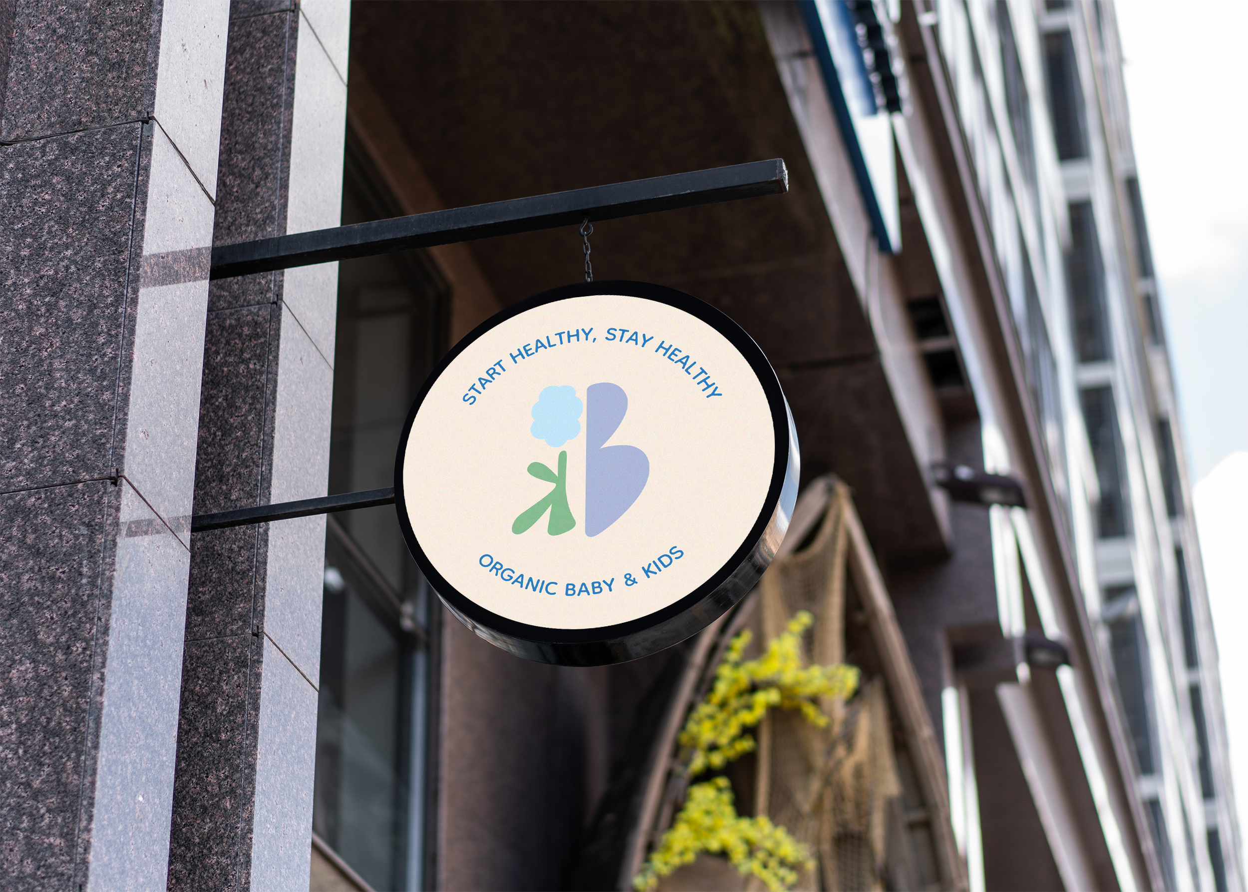
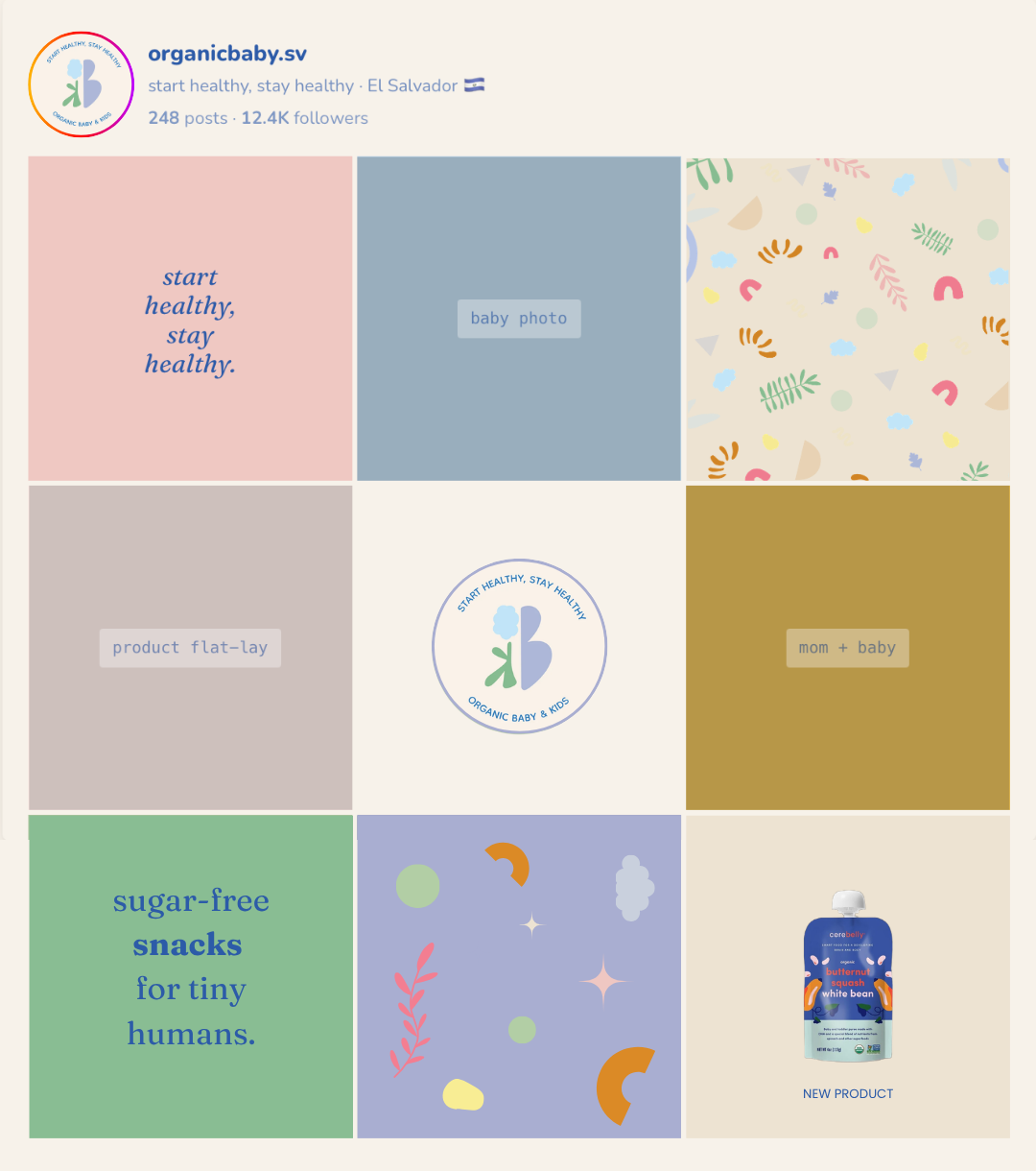
The logomark combines nature inspired shapes into one unified form. A blue cloud evokes softness and air, the green stem represents growth, and the lavender shape creates balance and warmth.
Together, the elements form a small ecosystem designed around childhood, nature and gentle simplicity.
Subtly, the shapes also suggest the initials O, B and K, embedding the brand name within the symbol itself.
04 · THE MARK
Three letters, one little garden.
+
+
=
The full seal is used as the main expression of the brand identity across labels, stickers and signage.
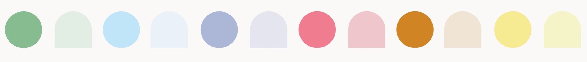
05 · PALETTE
Pastel skies, warm earth, one cobalt anchor.
Soft shades of sage, sky blue, periwinkle and cream create the foundation of the palette. Blush pink, terracotta and butter yellow add warmth and playful contrast, giving the identity a gentle and optimistic character.
06 · TYPOGRAPHY


07 · PATTERN
A little garden you can wear, wrap, or carry.
The supporting pattern is composed of playful scattered elements including cotton clouds, sage leaves, mustard suns, terracotta arches, pink dots and tiny triangles. Each symbol can be used individually or combined into richer compositions for packaging, textiles and digital applications.

08 · APPLICATIONS
How it lives in the world.
Retail signage. A round hanging sign in cream and cobalt becomes the brand’s first hello on the street, a single, legible mark you can read from across the block.

Retail expression. The visual identity comes to life throughout the storefront, from the circular logo on the main window to the playful paper cut elements on the door and the subtle “Start healthy, stay healthy” message above.

Packaging. Boxes wear the full scattered pattern. The wordmark sits quietly in the middle, letting the shapes do the joy work.
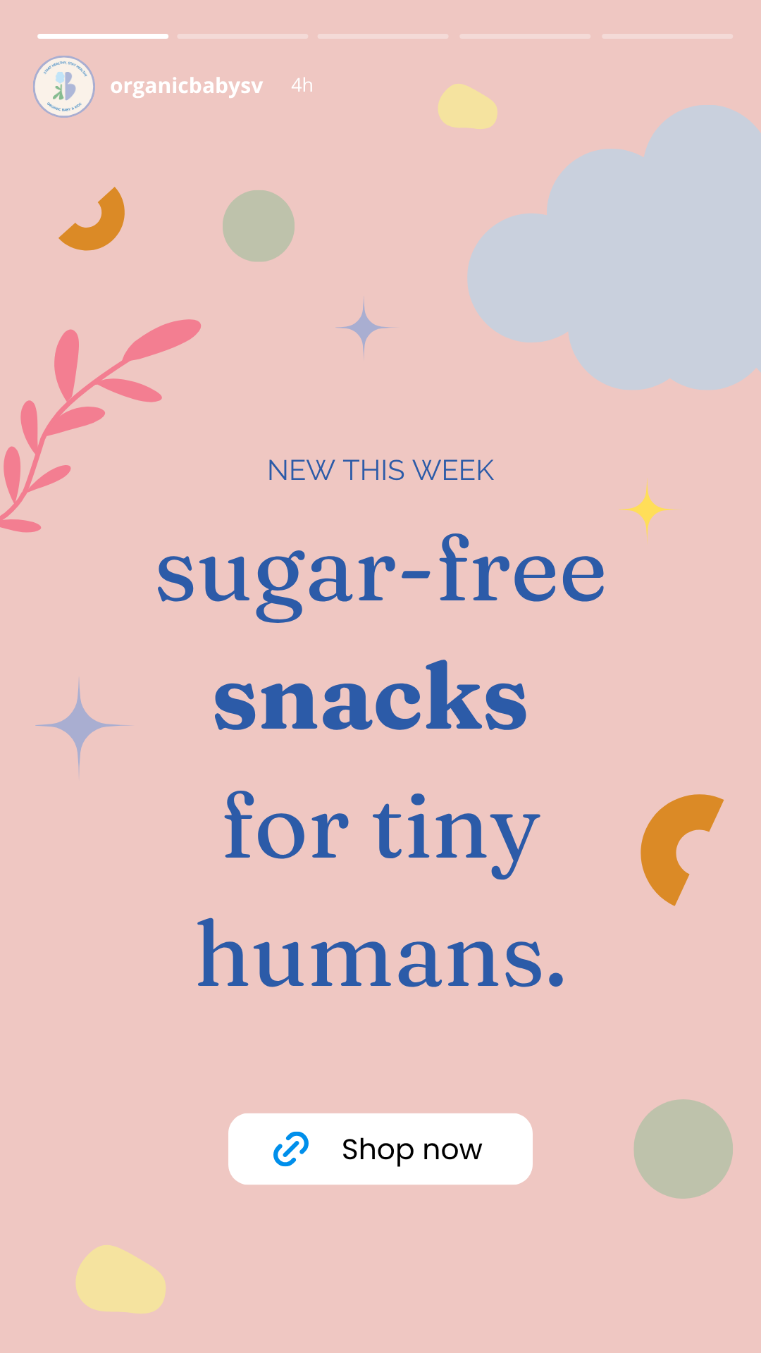
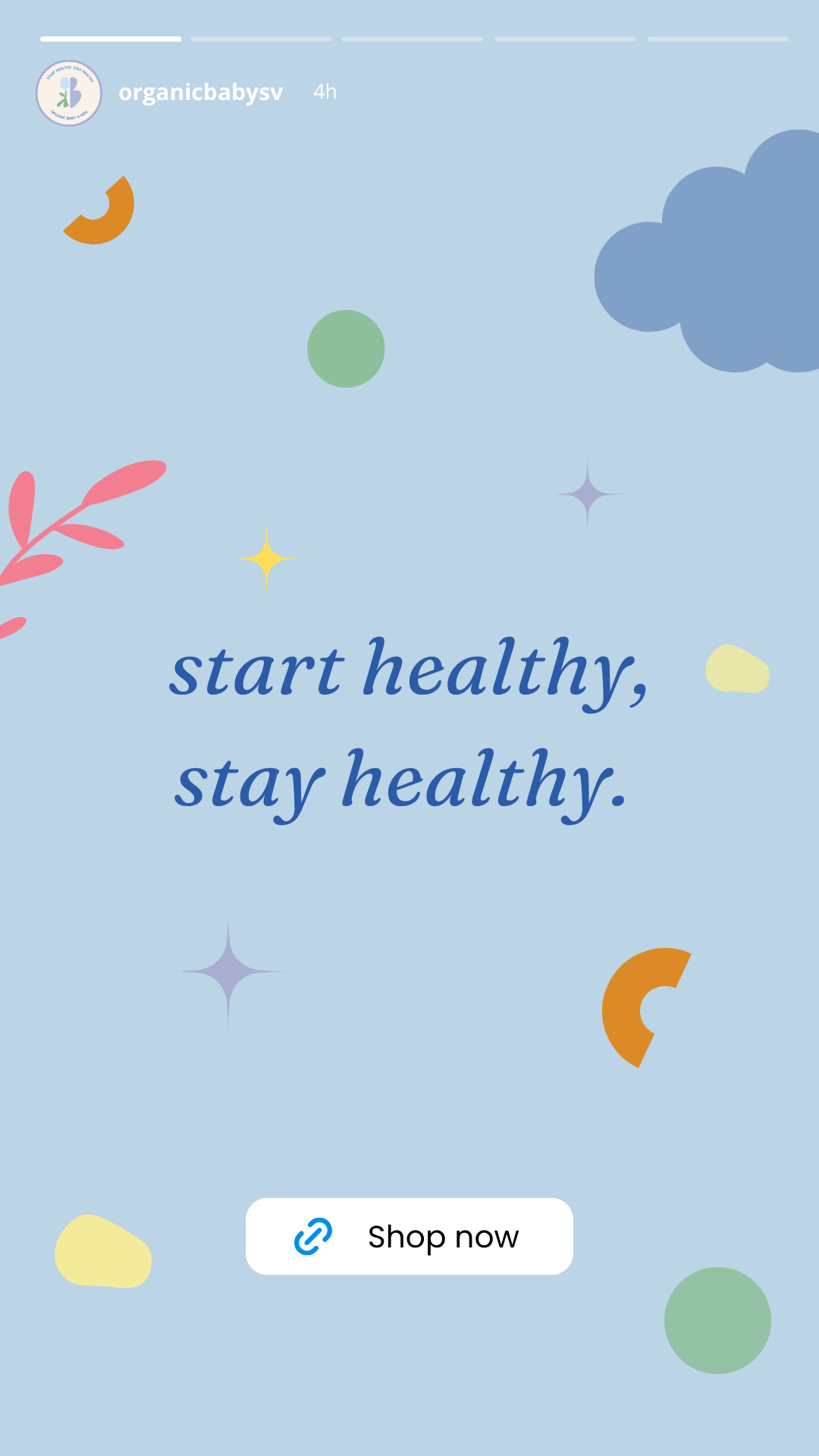
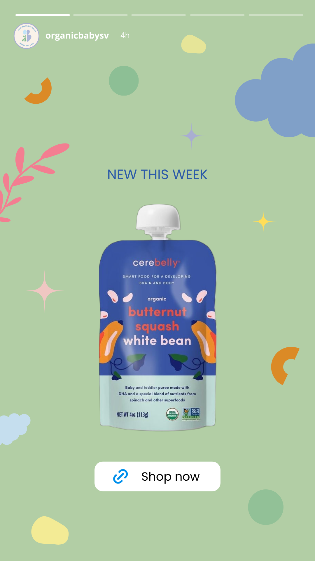
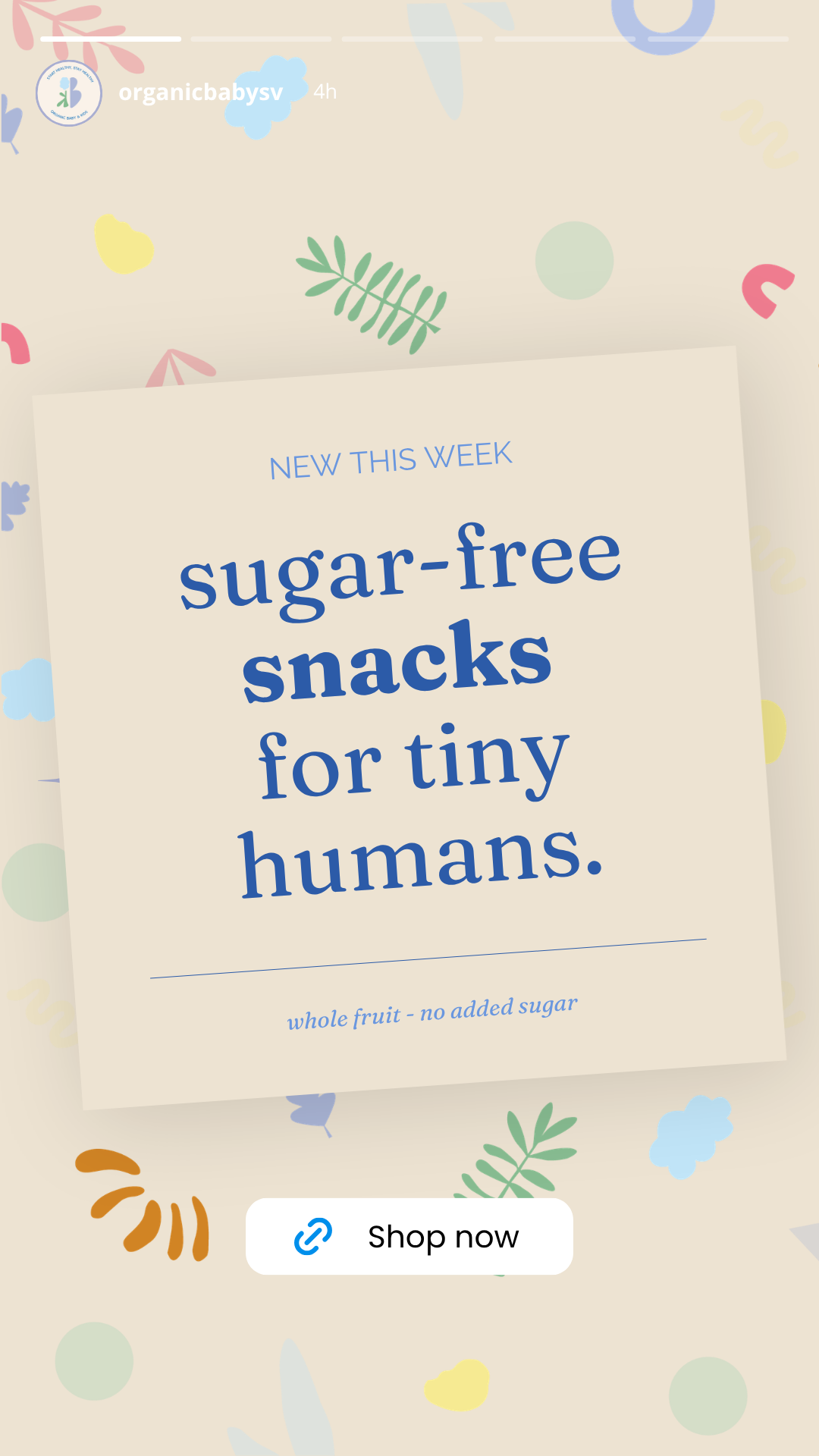
Story templates. A flexible set of color driven compositions created for launches, announcements and daily social content.
Instagram feed. A curated rhythm of quotes, product imagery, patterns and color driven compositions that keeps the feed cohesive while always feeling fresh.