UX/UI
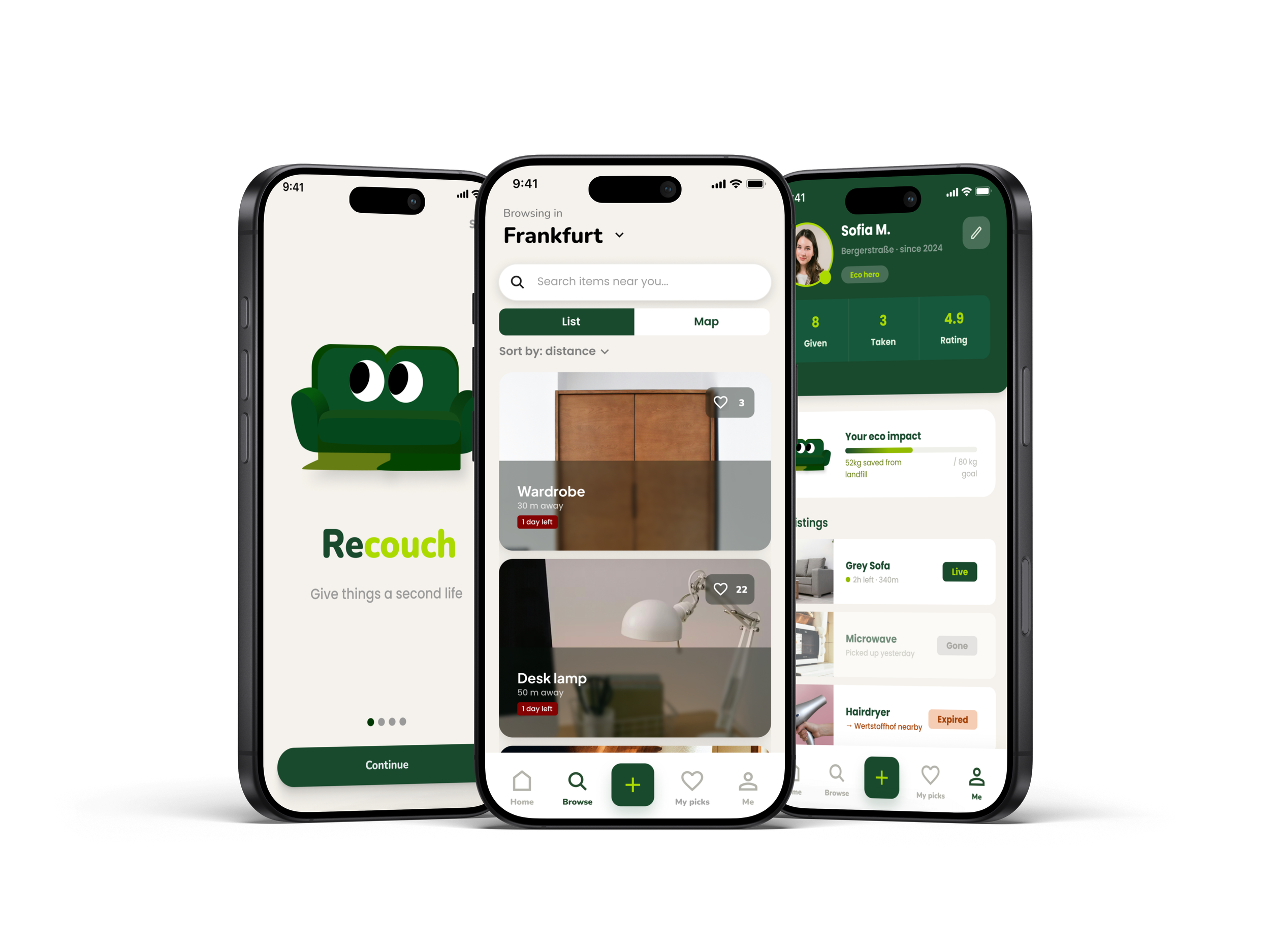
Recouch
SOLO PROJECT - UX/UI Design
-
Recouch works around the Sperrmüll system. When someone has an item to give away, they post it in seconds, it appears on a live map with a countdown showing how long until the collection truck arrives. Neighbours can claim it, coordinate a pickup, and give it a second life. Big items are registered for Sperrmüll automatically as a backup. Small items that no one claims get redirected to the nearest Wertstoffhof. Either way, nothing ends up as waste by accident.
-
The design combines softness and clarity, using neutral colors, structured layouts, and friendly typography.
The site introduces her services, approach, qualifications, and a contact section, all focused on accessibility and simplicity. -
Solo UX/UI designer. I led the full process; from street observation, desk research, surveys and interviews in Frankfurt, to persona definition, SWOT analysis, journey mapping, user flows, wireframing, brand identity, and a high-fidelity prototype in Figma. Tested and iterated based on usability findings.
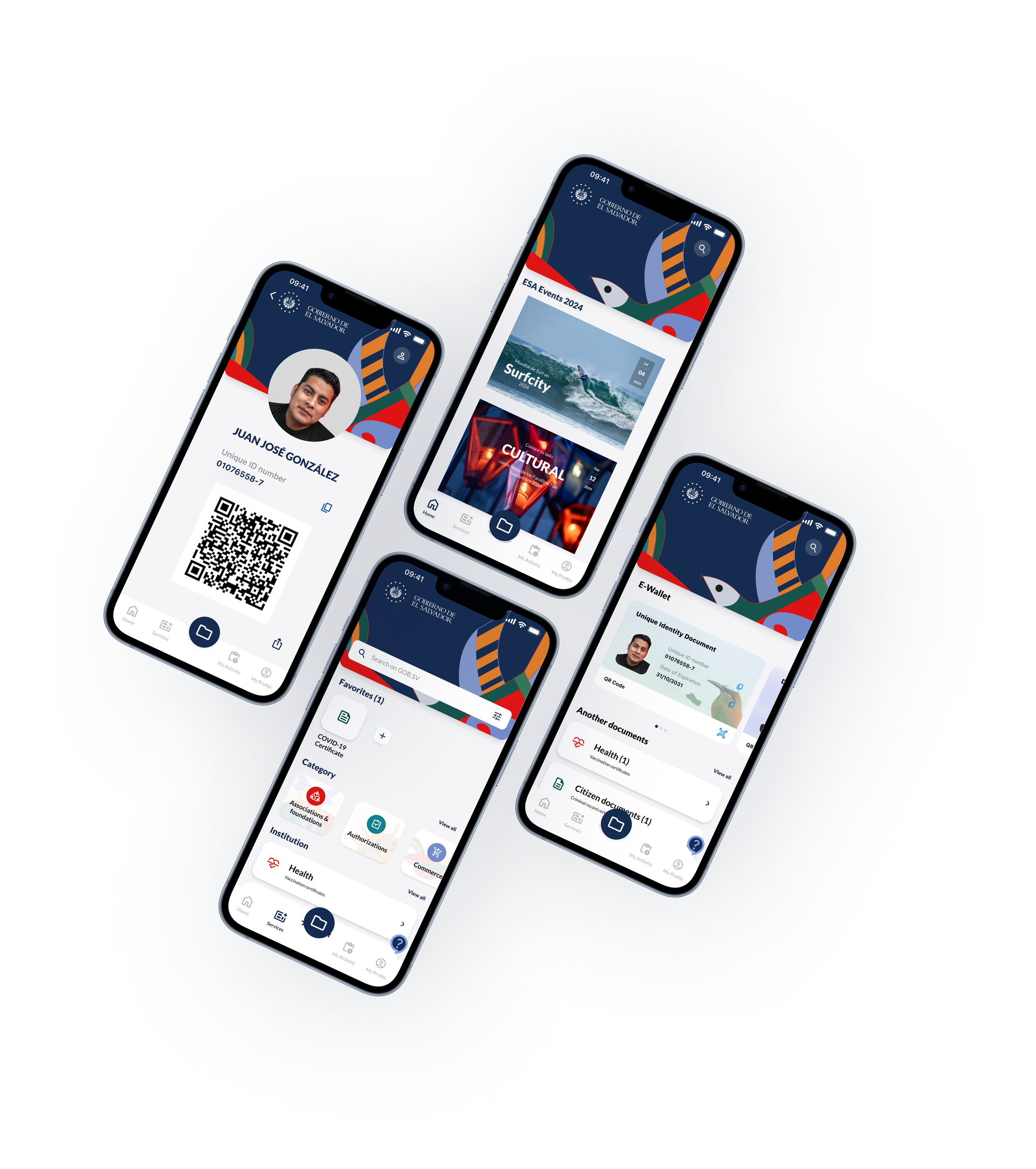
Gob.SV
Academic Project (Thesis) - UX/UI Design
-
Public services in El Salvador are highly centralized and often difficult to access, especially for citizens outside the capital. Bureaucracy, long travel distances, and limited digital infrastructure create daily barriers.
The challenge was to design a mobile platform that simplifies processes, improves accessibility, and rebuilds trust between citizens and the state.
-
A centralized app that brings together public services like ID requests, tax info, subsidies, payments, and official announcements. The design balances functionality and cultural identity to feel warm, local, and human-centered.
-
As my thesis project, I led the concept development, user research, UX/UI design, and prototyping. I focused on accessibility, visual clarity, and designing features such as service search, e-wallet, digital documents, reminders, and cultural discovery tools.

Health o’clock
Freelance Project - UX/UI Design + photography
-
The client, a nutritionist based in Germany, needed a personal website to present her services and allow clients to request appointments easily.
The goal was to create a clear, calming, and professional online presence that builds trust with potential clients. -
The design combines softness and clarity, using neutral colors, structured layouts, and friendly typography.
The site introduces her services, approach, qualifications, and a contact section, all focused on accessibility and simplicity. -
I was responsible for the full design and implementation of the website.
This included creating a new logo, designing the user interface and experience, and building the site using a no-code platform.
I also directed and edited all website photography to ensure visual consistency and a cohesive brand presence.
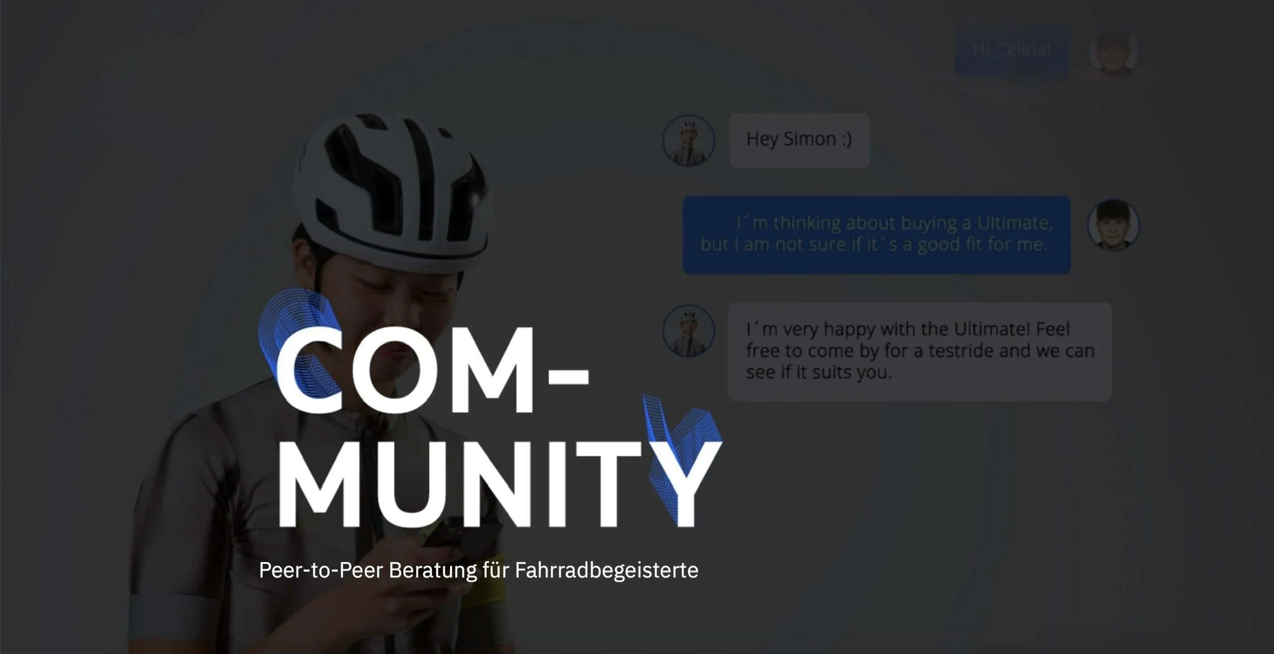
Community - Canyon GmbH
Academic Project - UX / UI Design
-
To make Canyon test rides more accessible to potential customers who can’t travel to the headquarters in Koblenz.
The aim was to create a more sustainable and community-driven solution that connects bike enthusiasts and builds trust in the buying process, without requiring expensive or long-distance travel. -
The idea was to create a peer-to-peer platform where local Canyon riders called "Enthusiasts" offer test rides, fittings, and personal advice to potential customers.
This system allows real-world feedback and authentic interaction through meetups, group rides, or 1:1 consultations. It turns Canyon customers into brand advocates while helping others make informed decisions. -
As part of a 3-person team, we developed the concept and designed the digital platform that facilitates these connections.
My contributions focused on:Designing UX flows for booking, filtering, and contacting local riders
Creating the UI design and visual system of the app
Defining the application and onboarding process for Enthusiasts
Prototyping mobile interactions and features that support community engagement
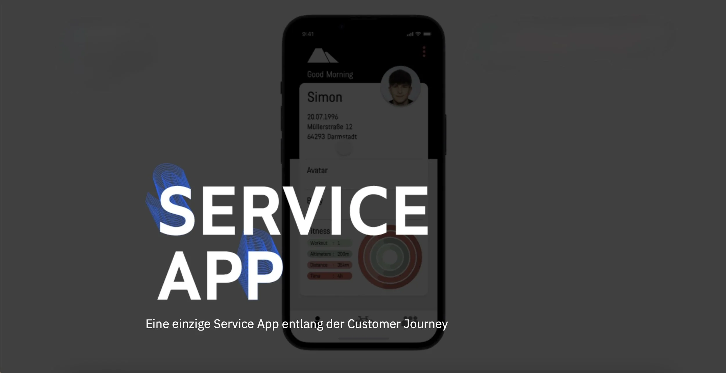
Service App - Canyon GmbH
Academic Project - UX/UI Design
-
To extend the Canyon brand experience beyond the webshop and into a digital ecosystem that supports the entire customer journey, from pre-purchase decisions to post-purchase ownership.
The goal was to create a single app that integrates multiple services developed across five different design projects, offering a more connected, personalized bike experience. -
The Service App was designed as a multifunctional companion for Canyon customers, with three main areas:
Rider – for tracking fitness data, body scans, and customizing personal avatars
Bike – for managing current or future bikes, including digital fittings, a garage, and NFTs
Community – for joining events, reading blogs, and connecting with other riders
The app supports both rational decisions and emotional connections, making the ownership experience richer and more interactive.
-
As part of a multidisciplinary team, I helped develop the structure and experience of the app.
My contributions included:Shaping the concept and structure of the three core areas (Rider, Bike, Community)
Designing user flows and features across different service layers
Creating visual elements for app content, including UI mockups and functional layouts
Helping define how the app extends and enhances Canyon’s existing digital platform
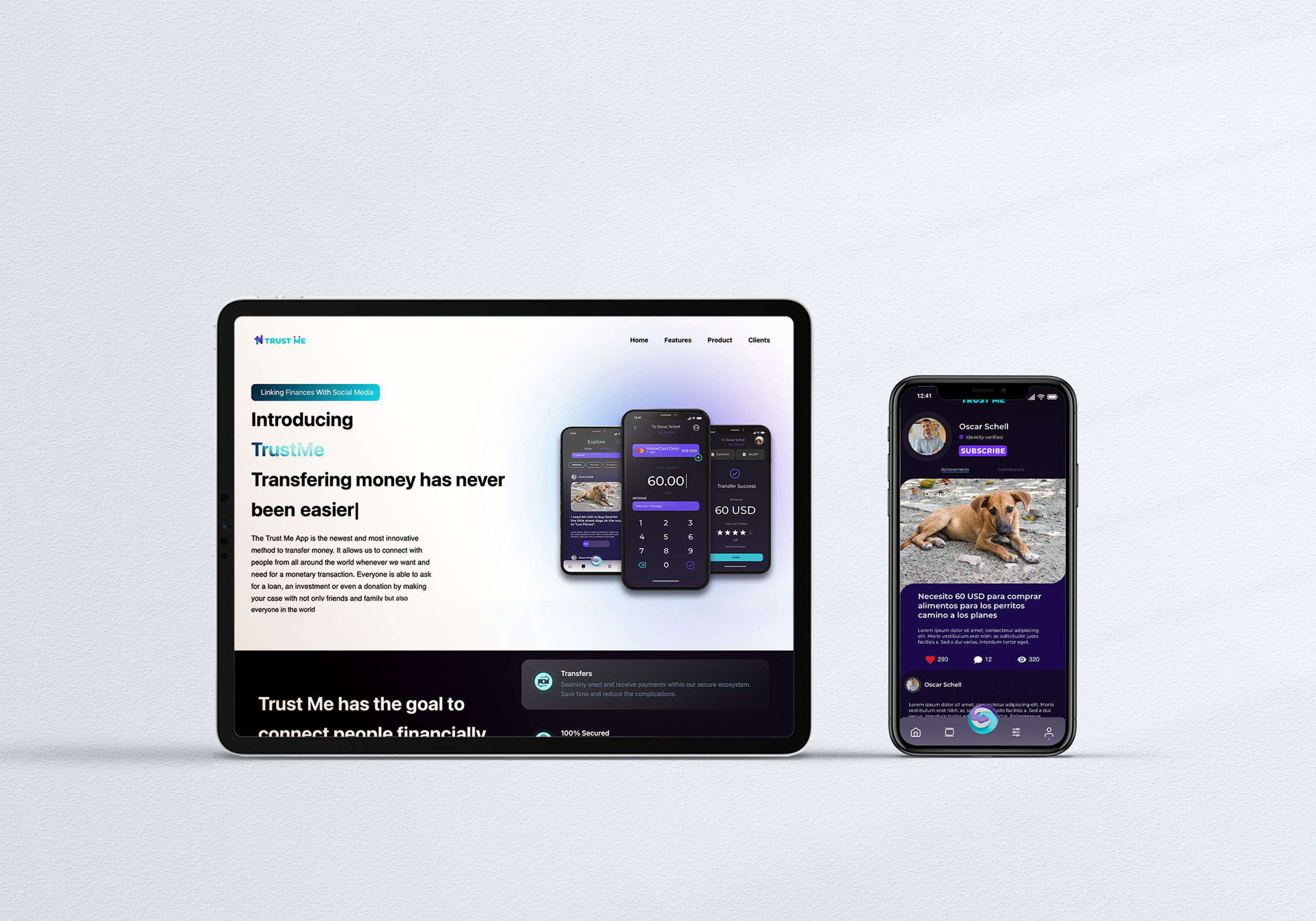
Trust Me
Freelance Project - UX / UI Design
-
Trust Me is a concept app focused on connecting people from different socioeconomic backgrounds through small, human-centered monetary exchanges.
In a world shaped by digital communication, the app explores how technology can help foster empathy, generosity, and emotional connection. -
The UI design reflects the values of clarity, empathy, and trust.
A bold, modern color palette purple (#683AF5), aqua (#36C5D6), and deep black (#0E0A17) was chosen to express openness and credibility.
The visual language is clean, intuitive, and emotionally engaging.
The interface was designed to be minimal, accessible, and emotionally resonant. -
I was in charge of UX and UI design for the concept.
My work included interface design, color and type system, screen flows, and iconography.
I aimed to turn the app’s mission into an intuitive, emotionally engaging user experience.
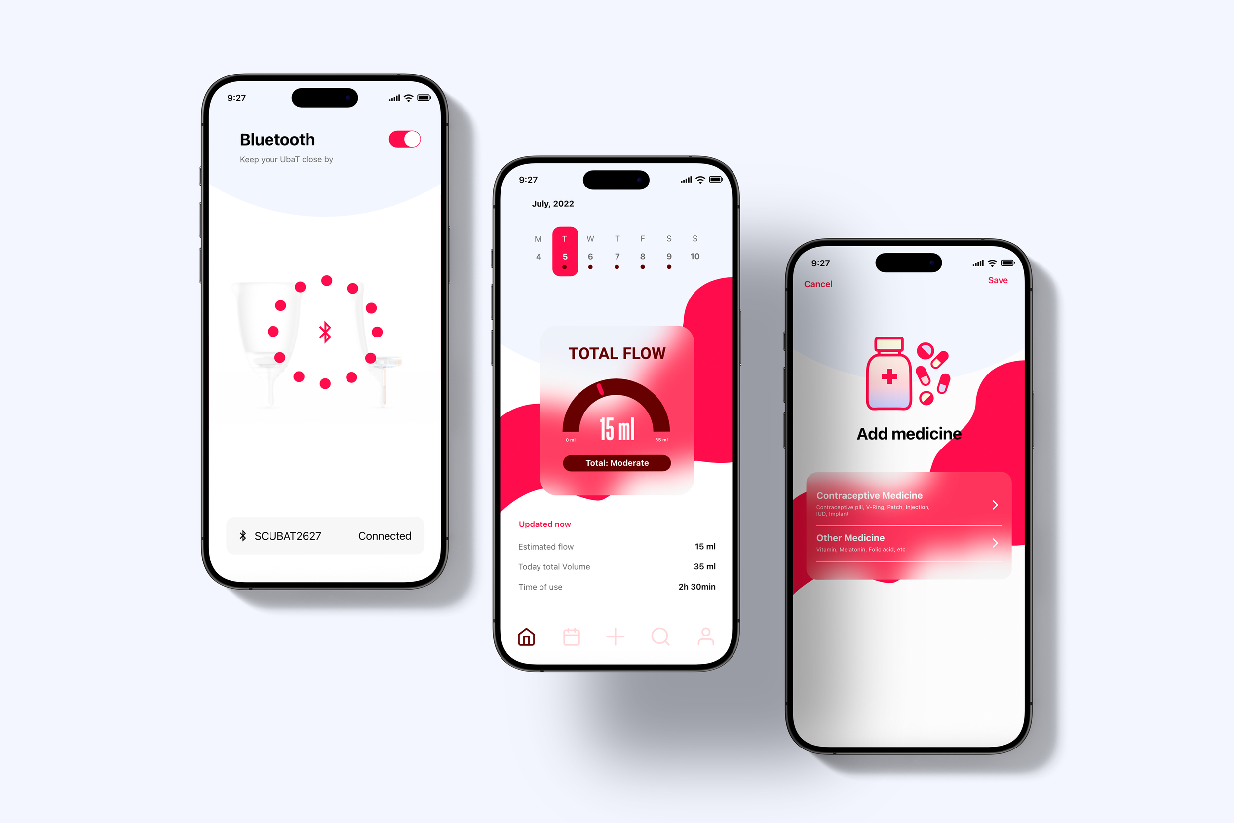
UbaT
Academic Project - UX/UI Design
-
How can we digitize a common and intimate product that has traditionally remained analog?
The challenge was to design a connected experience around a menstrual health product by integrating technology in a way that is sensitive, useful, and respectful of privacy. The focus was on transforming physical data (like menstrual flow) into meaningful, empowering digital feedback. -
The result was a fully functional app prototype that transforms a physical product into a smart self-care tool.
This project explores the connection between the body and technology, and how design can respectfully support intimate, often overlooked experiences.
Menstrual health is still surrounded by discomfort and stigma. Yet it is deeply connected to confidence, safety, and dignity. With this app, I aimed to reduce the stress that comes from uncertainty, like not knowing when to empty the cup or the fear of leaking onto your clothes. Thoughtful technology can turn a traditionally taboo topic into an empowering, informed, and calming part of everyday life. -
Conducted user research to explore needs, habits, and taboos around menstrual tracking
Developed the app concept to enhance the relationship between the user and the physical product
Created UX flows, wireframes, and high-fidelity prototypes using Adobe XD
Designed the visual language, including icons, colors, and emotional tone
Documented the full design process, focusing on empathy, usability, and ethical health tech
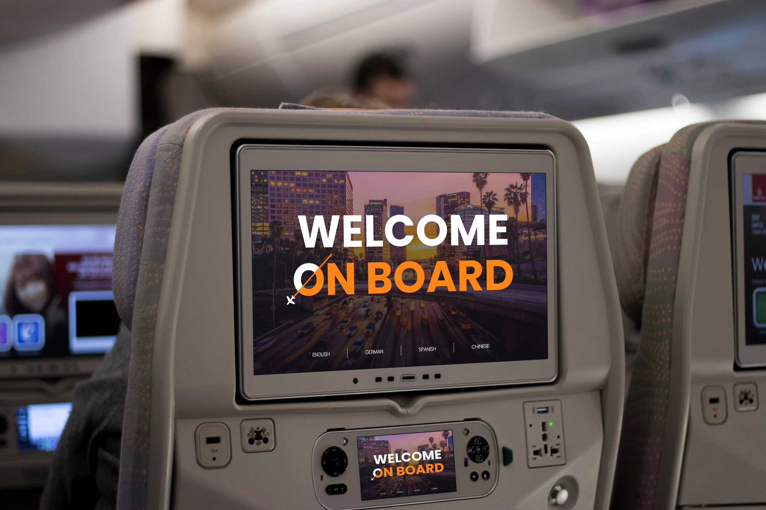
TimeFly: In-flight experience concept
Academic Project - UX / UI Design
-
To reshape the in-flight experience by making time feel shorter, more enjoyable, and socially engaging.
The challenge was to reduce the perception of flight duration through entertainment, real-time flight tools, and meaningful passenger interaction, all within a single seat interface. -
The system introduces multiple interactive modules: Watch, Listen, Play, Chat, Write & Read, Shop, Journey, and Dine, to support both personal immersion and social connection.
Whether passengers want to enjoy a movie, play games, write a story, or chat with a traveler headed to the same destination, the platform allows them to curate how they experience time in the air. -
I led the concept, user experience design, and interface prototyping for this project.
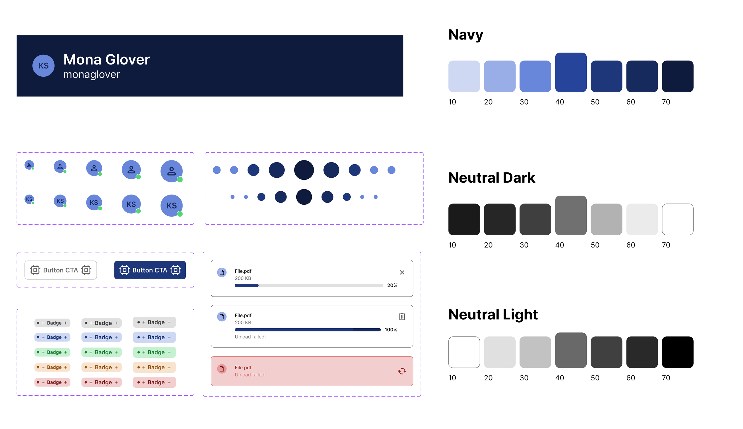
Design System
Internship - UX/UI Design
-
To design a scalable, flexible design system at JAX IT GmbH, a digital solutions agency, that could be offered to multiple clients across industries.
The goal was to improve consistency, efficiency, and adaptability in user interfaces across both desktop and mobile platforms. -
The system was built using atomic design principles to ensure modularity and reusability.
From dashboards to mobile UI components, the system was designed to adapt to each client’s specific needs while maintaining a coherent structure and visual language. -
As a UX/UI Designer during my 5-month internship, I contributed to the development of the design system for client-facing projects. My responsibilities included:
Designing atomic and reusable components
Creating responsive templates for desktop and mobile interfaces
Documenting design principles
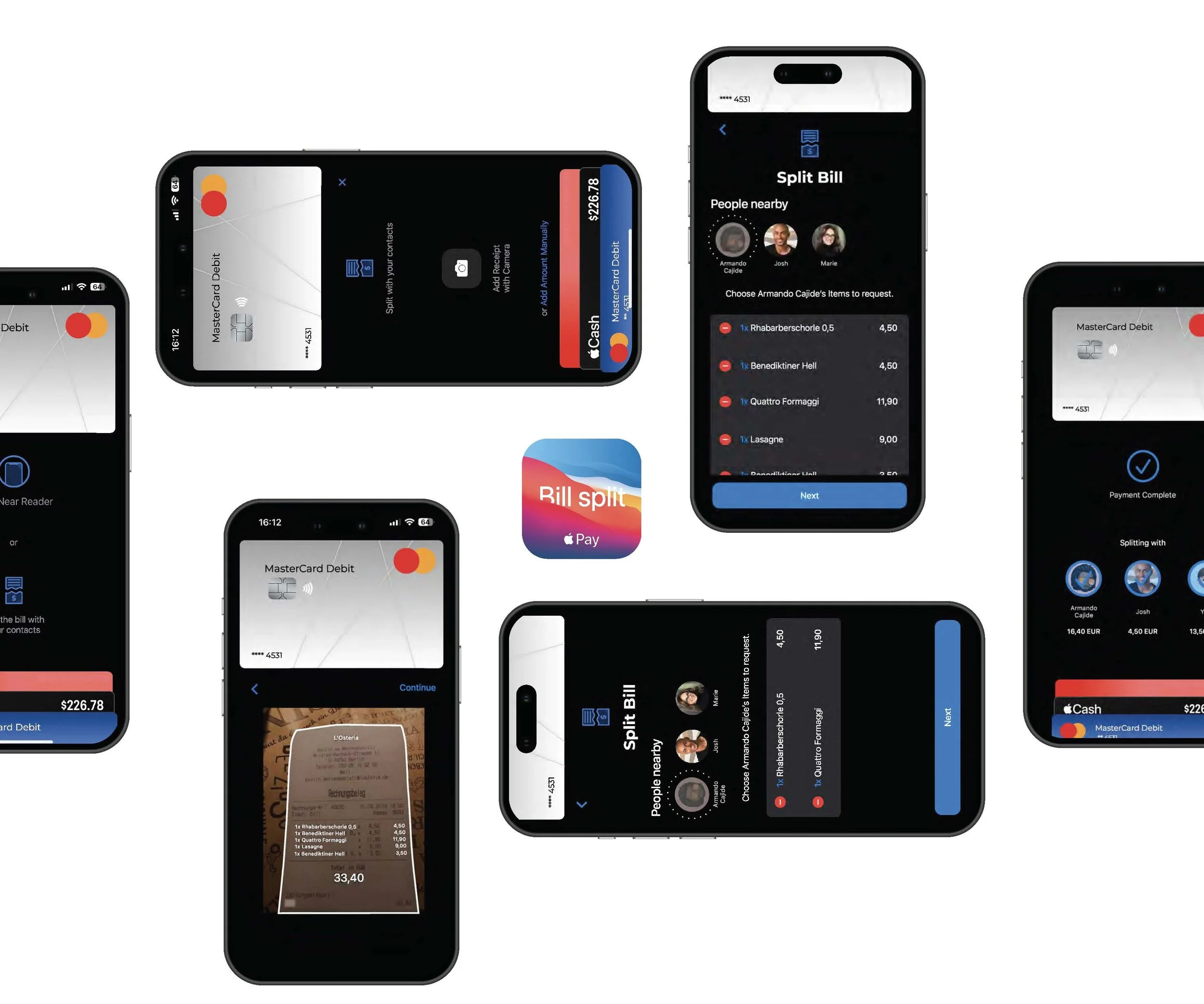
SplitEase
Academic Project - UX/UI Design + photography
-
To simplify the bill-splitting experience by integrating a seamless, transparent process directly into Apple Pay, making shared payments easier, faster, and argument-free.
-
SplitEase introduces a built-in Apple Pay feature that allows users to split any payment instantly with friends or contacts.
With just a tap, the original payer can divide the amount, send individual requests, and track who has paid, all without needing a separate app, calculator, or awkward conversation. -
I developed the concept and user experience flow for this integrated Apple Pay feature.
My tasks included:Defining the core interaction for initiating and managing split payments
Designing wireframes and high-fidelity UI mockups
Creating interface components consistent with Apple’s design system
Prototyping the flow to demonstrate usability and clarity in real scenarios
BRANDING
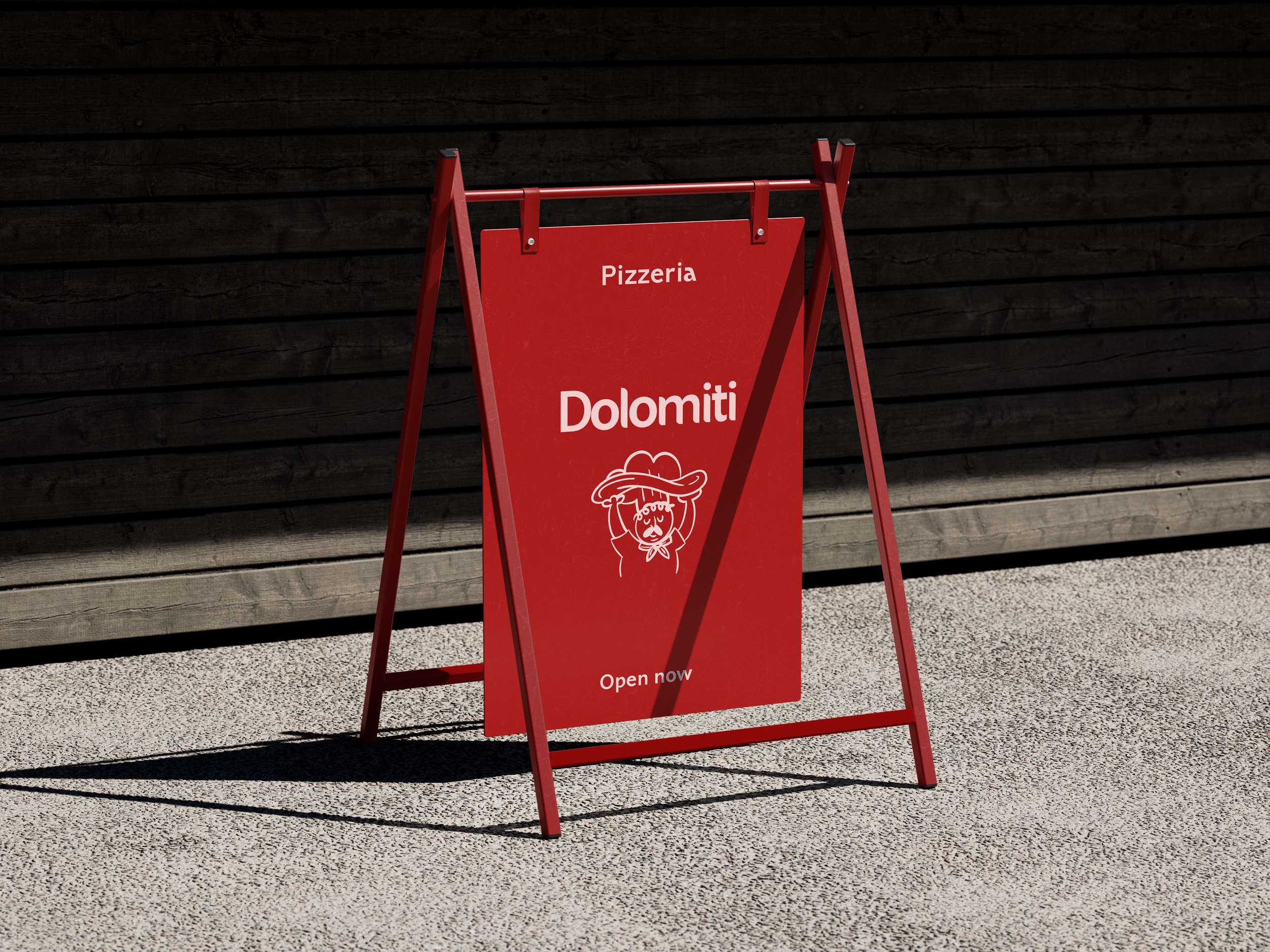
Dolomiti Pizzeria
Academic Project - Visual Rebranding
-
The restaurant had an outdated and inconsistent visual identity that didn’t reflect the quality of its food or the warmth of Italian cuisine.
The original logo lacked personality, and the overall branding failed to attract or engage potential customers.
From physical signage to digital platforms, the visual presence wasn’t inviting, making the restaurant easy to overlook in a competitive city like Frankfurt. -
A bold, handcrafted identity inspired by the energy of a real Italian kitchen.
The new branding captures Dolomiti’s unique experience: over 100 pizzas and pastas made fresh in front of you, using classic Italian ingredients and techniques.
Warm colors, playful shapes, and an expressive pizzaiolo illustration bring the brand to life. -
University project focused on visual rebranding.
I designed the logo, illustrations, and overall identity to reflect a handcrafted, authentic Italian experience.

Organic Baby & Kids
Freelance Project - Visual rebranding
-
The original logo and branding were simple and clean, but lacked warmth, playfulness, and a clear visual system.
It didn’t fully reflect the brand’s focus on organic values or its baby & kids niche.
There was also no pattern or brand language to use across packaging or social media. -
A soft, playful identity inspired by nature and early childhood shapes.
I designed a custom logomark, gentle typography, and a pastel-based color palette to create a warm, trustworthy feel.
The brand now includes a flexible graphic system: custom pattern, packaging design, and visual assets for Instagram. -
This was a freelance project for a online shop based in El Salvador.
I worked on:
– Logo redesign
– Color and typography system
– Custom pattern
– Instagram posts & stories
– Packaging visuals and brand mockups
PACKAGING
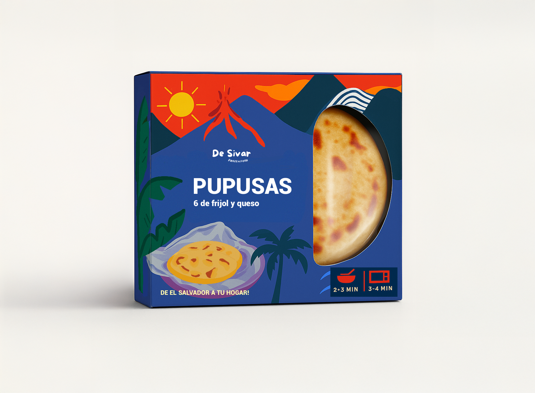
De Sivar: Frozen food
Own Project - Packaging design
-
How can we bring Salvadoran comfort food to people who are far from home, without losing its cultural and emotional richness?
The challenge was to design export-ready packaging for frozen traditional meals that not only protects the product, but also conveys the warmth, nostalgia, and identity behind every dish.
-
“De Sivar” is a frozen food brand designed for Salvadorans living abroad, a way to reconnect with the flavors and memories of home, no matter where they are.
The visual identity blends cultural richness with everyday practicality: warm colors, traditional elements, and expressive textures turn each product into a piece of home.
-
I developed the full brand and packaging design, including naming, visual storytelling, structure, and layout.
I focused on capturing Salvadoran identity in a form that could travel
- both physically and emotionally
- through food
PRODUCT DESIGN
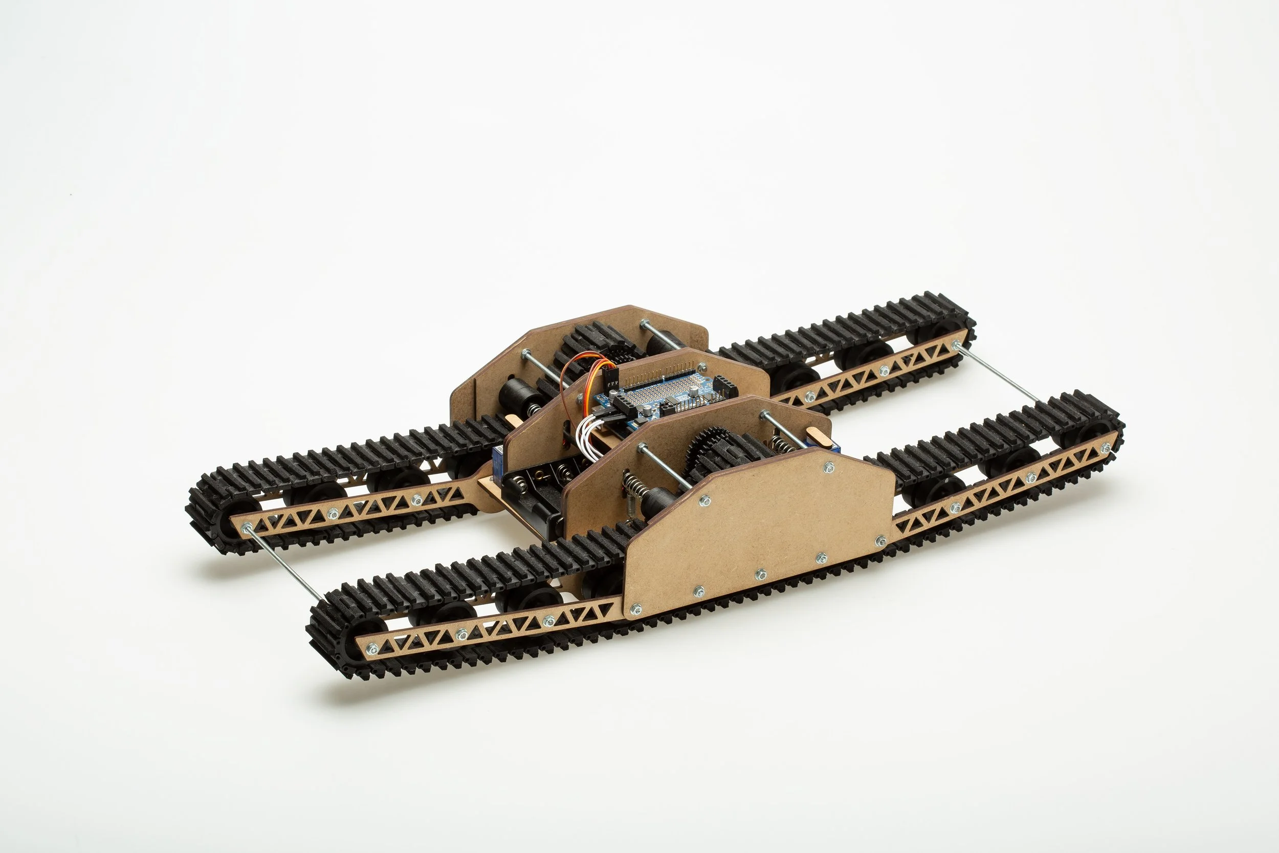
Arduino Climber
Academic Project - Product design
-
To build a compact robot vehicle capable of overcoming a multi-part obstacle course, including steep inclines, uneven terrain, a trench, and a descent, all while respecting a strict size constraint of 20×20×20 cm at the starting position.
The project aimed to balance functionality, adaptability, and mechanical precision under real-world physical limitations.
-
The core idea was to design a transformable robot that could expand its body length during the course to overcome a 25 cm trench, longer than its base size.
We used a track-based system combined with folding front and rear arms that extended before movement began. A gear-reduction drivetrain was chosen to optimize climbing power and stability across all obstacles.
-
I participated in the development of the vehicle from concept to construction. It was a two-person team.
My tasks included:Contributing to mechanical strategy and form decisions
Assisting with CAD modeling and physical prototyping
Documenting the process and presenting technical solutions
Collaborating on obstacle testing and iterative refinement
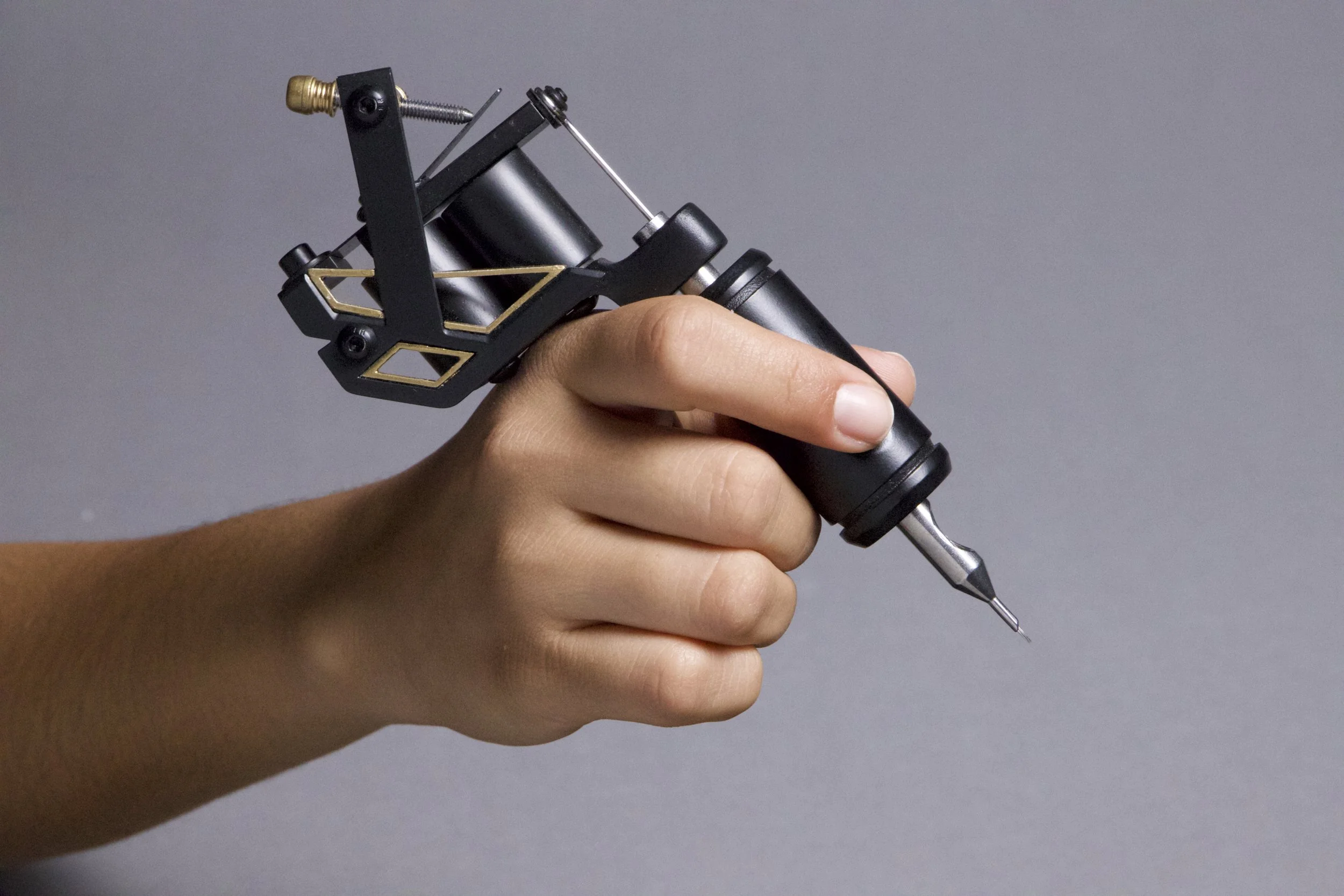
BRASSLINE
Academic Project - Product design
-
To design a tattoo machine that combines technical precision with aesthetic sensitivity, offering both performance and visual character for professional tattoo artists.
-
"Brassline" merges elegance and performance. The name reflects the machine’s ability to draw fine lines and the use of brass to accent its form. The design was driven by the theme Feinsinn, focusing on subtlety, contrast, and refined mechanical beauty.
-
Developed the product concept, selected materials and finishes, and designed the form of the machine.
My tasks included:
Material research and prototyping
3D modeling and refinement of functional aesthetics
Defining color, contrast, and exposure of the coil
Communicating mechanical performance through visual detail