PRAKTIKUM
Design system
USER INSIGHT
Even before working with specific clients, JAX IT observed recurring patterns and pain points across digital platforms: inconsistent UI elements, duplicated design efforts, and slow onboarding of visual systems.
Rather than starting from scratch for each project, the team aimed to create a unified design foundation that could be offered to future clients as part of the agency’s value proposition, saving time, reducing development costs, and improving UX from day one.

CONCEPT
The design system was developed in advance, with the future in mind. Using atomic design methodology, it provided a full set of components and templates that could be customized and scaled as needed.
The structure included:
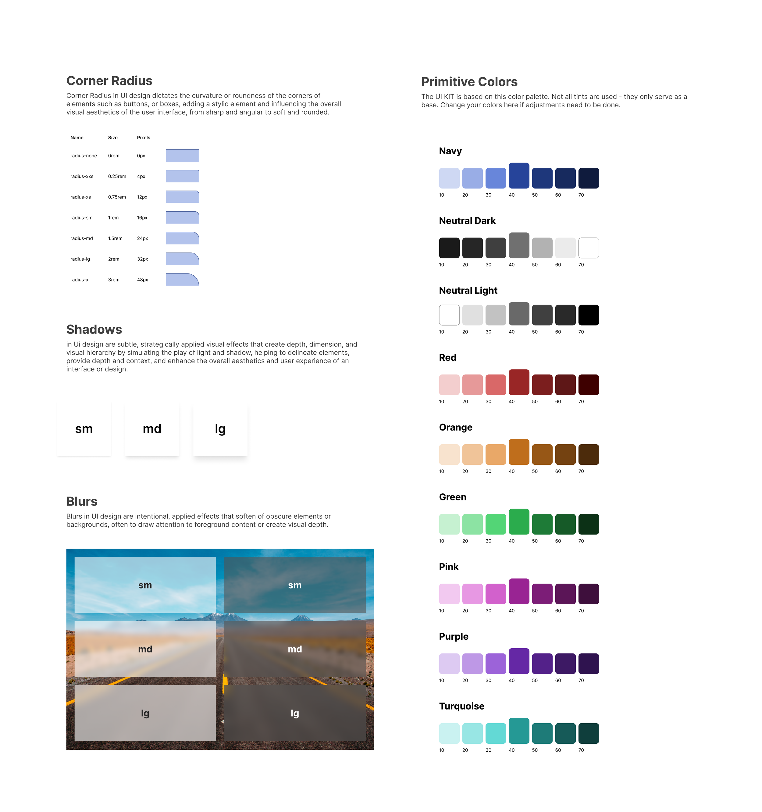
Atoms: colors, typography, buttons, icon sets
Molecules and Organisms: form groups, filter bars, nav elements
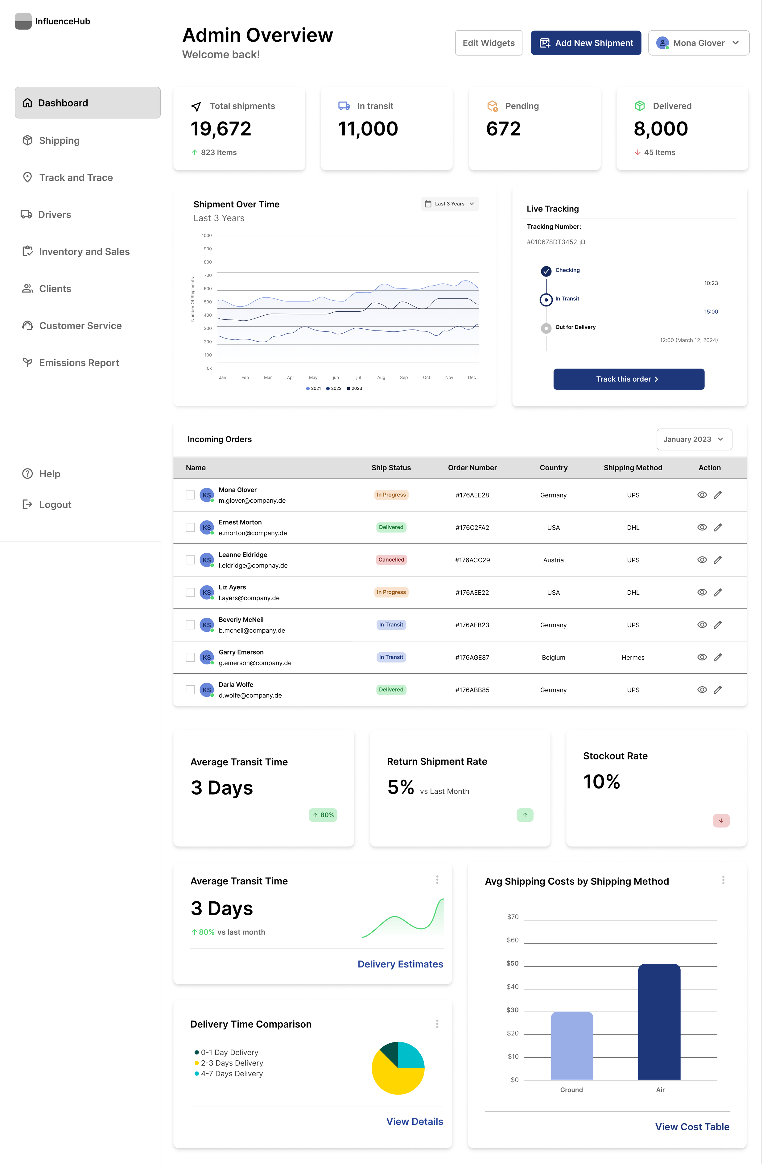
Templates: pre-built layouts for dashboards and mobile screens
The system aimed to be brand-agnostic yet structured, helping JAX IT deliver polished, consistent interfaces quickly once a new project began.

DESIGN
Following design principles of clarity, adaptability, and consistency.
I used Figma to:
Create a library of components using atomic logic
Design templates for key screen types (e.g., analytics, forms, overviews)
Document layout rules, breakpoints, spacing and color usage
Ensure responsiveness across desktop and mobile
The result was a pre-built, scalable design system that positioned JAX IT to respond faster and more confidently to client needs, with a robust visual toolkit ready for immediate customization.

