DIPLOMARBEIT · HOCHSCHULE DARMSTADT · SOMMERSEMESTER 2024

Every service.
One place.
gov.sv is a mobile app concept that consolidates fragmented government services IDs, taxes, fines, certificates, social aid into one accessible, transparent and human interface. Researched and designed in collaboration with the Office of the Secretary of Innovation of the Presidency of El Salvador.
UX/UI Designer
Solo design
ROLE
TYPE
FIGMA · ADOBE CREATIVE CLOUD
TOOLS
Should take 15. La Prensa Gráfica, 2024.
Fragmented across dozens of websites and offices.
+14.4% YoY. 9.94M mobile connections in a country of 6.35M.
Women are 15% less likely to access internet. Only 26.5% have basic digital skills.
El Salvador is the smallest and most densely populated country in Central America. Most public services are concentrated in San Salvador, outside the capital, a simple document means a day-trip, or further.
In 2023, a municipal reform reduced municipalities from 262 to 44. The intent was efficiency. The result was longer queues, system outages, and citizens travelling further for documents that expire within three months.
For low-income citizens, every hour in line is an hour lost from work. Bureaucracy doesn't just cost time, it costs income, dignity, and trust.
The infrastructure is arriving. The interface to it isn't.
A small country with
a big centralisation
problem.
01 / CONTEXT

21,041 KM² · 6.35M PPL
PAIN 01 · FRAGMENTATION
The current state is a
digital labyrinth.
02 / PROBLEM
A handful of services are online, scattered across a dozen unrelated portals, none designed together.
One task, four websites.
To pay for a DUI renewal, citizens move between the government login, the bank's payment portal, the RNPN site, and back each with different authentication, different design, different URLs. The journey is a treasure hunt.
PAIN 02 · TIME
PAIN 03 · INCLUSION
Tech that excludes its users.
An hour for fifteen minutes.
Birth certificates required for almost every other procedure and only valid for 3 months, take 67 minutes on average to issue, in person, in San Salvador. System outages are routine.
Women are 15% less likely than men to use the internet. Only 26.5% report basic digital skills (vs. 48.3% of men). Older citizens often rely on grandchildren. Any solution must work for the user with a borrowed phone and a one-bar signal.
I'm Salvadoran. I grew up in El Salvador until I was 18, and I've lived in Germany for the last six years.
The contrast is constant. In Germany, recurring tasks like rent and taxes happen in the background; in El Salvador, every official document means hours in line. First the office, then the bank, then back to the office.
On one of my visits I needed paperwork done. I spent half a day in queues. The frustration wasn't mine. I was on holiday. The man next to me had taken a day off work he couldn't afford to lose. That experience is the seed of this project.
I designed gov.sv as a love letter to a country I know intimately, and as a thesis for a German design school I'm now graduating from. It's the bridge between both halves of my life.
Why me.
03 / MOTIVATION
-Stefanie Radeschnig · SAN SALVADOR · DARMSTADT
From government insiders
to street-level users
04 / RESEARCH
Six months. Primary, secondary and benchmarking.
Outputs that survived contact with reality.
01 / discover
Field interviews
12 conversations with citizens across income levels, age groups, and rural/urban settings during my last visit.
02 / govt
Innovation Office
Multiple sessions with the Secretary of Innovation, Vladimir R. Handal, and Director General Erick Chang.
03 / desk
Benchmark study
Singpass (SG, 97% adoption), e-Estonia (99% online), gov.uk and Dubai Now were dissected for what travels.
04 / data
Quant baseline
DataReportal, ITU 2022 reports, EHPM 2020 survey, and La Prensa Gráfica's wait-time investigation.
05 / synth
Synthesis
From insights to four personas, three pillars, one How Might We and a defensible MVP scope.
Trust beats features.
Citizens have learned not to expect government IT to work. Singpass succeeded in Singapore because the state delivered tiny things flawlessly before scaling up. The MVP must do less, perfectly.
Hybrid, not digital-only.
For citizens without bank accounts or stable signal, the app must work as a guide to in-person services. Appointment booking, queue numbers, document checklists. Not just a replacement for them.
Mobile-first isn't optional.
9.94M mobile connections in a country of 6.35M. Most Salvadorans access the internet exclusively through their phones. A desktop-first sibling product doesn't help.
Identity is the wedge.
The DUI (national ID) is referenced in almost every other procedure. Owning the digital identity layer is what makes everything else possible: wallet, signature, social aid.
Three pillars.
One app.
05 / CONCEPT
HOW MIGHT WE
"How can a centralized app improve accessibility, efficiency, and user satisfaction when interacting with public services in El Salvador?"
PILLAR 01 / FIND
Find any service instantly.
AI-powered search across 2,000+ procedures. Citizens don't need to know the exact document name. They describe what they need and the system finds it. Organized by category and institution for those who prefer to browse.
PILLAR 02 / DO
PAIN 03 · INCLUSION
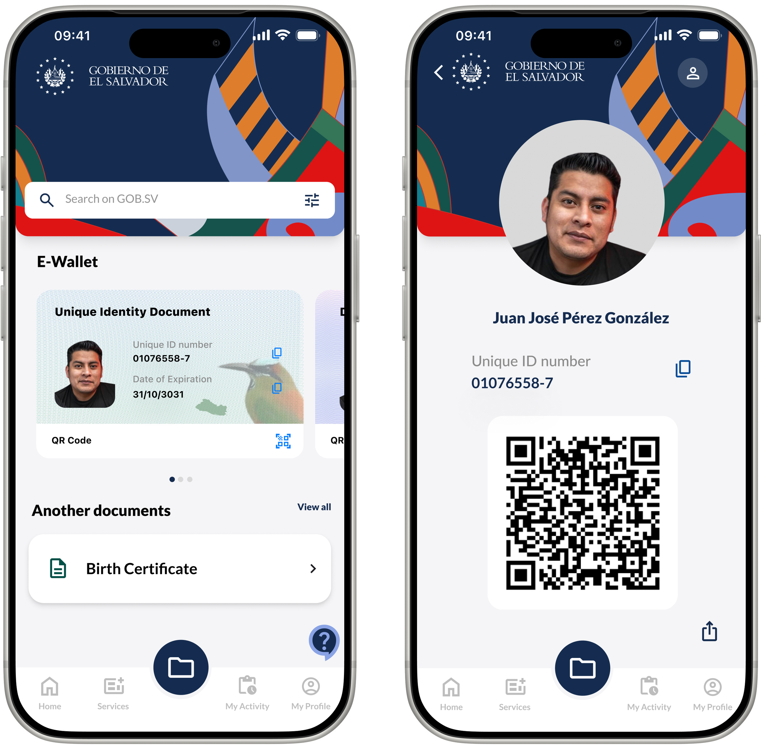
Your identity, always with you.
Complete it without leaving home.
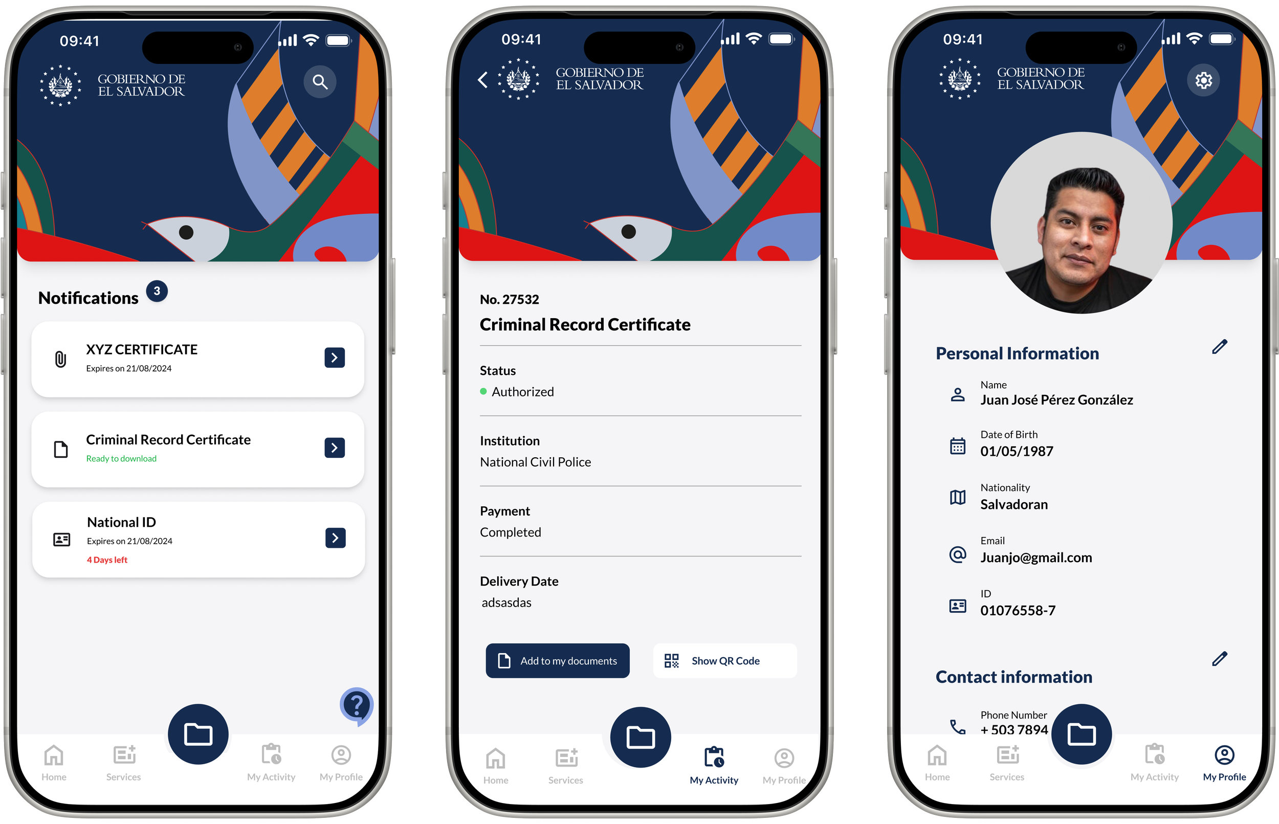
From request to payment to digital certificate, fully in-app. Multiple payment methods including cash-equivalent options for the unbanked. Status tracking at every step. Reminders before documents expire.
The E-Wallet stores DUI, health certificates, and key documents. A QR code lets citizens verify identity without revealing their address. Works offline once documents are cached.
Key design decisions.
Offline First
Core features work without signal. Stored documents, appointment details and procedure checklists are available offline. Designed for José, who only has WiFi at his employer's house.
Privacy by design
Security checkpoints can verify a citizen's identity via QR without revealing their home address. A deliberate choice for safety in El Salvador's specific context.
Built from the
soul
of El Salvador.
06 / DESIGN SYSTEM

COLOUR PALETTE
TYPOGRAPHY
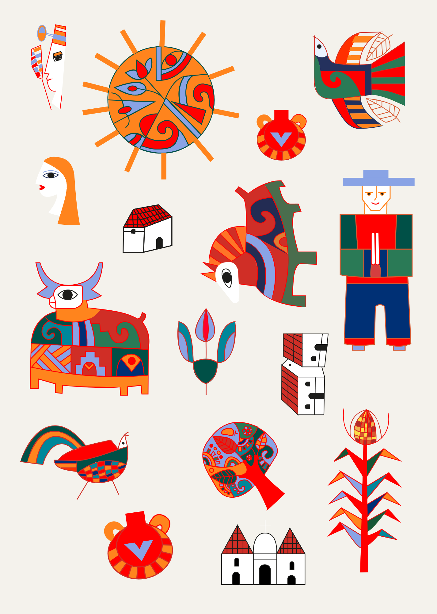
Inspired by Fernando Llort
Every
screen
in context.
07 / FLOWS
The app covers the most common interactions Salvadoran citizens have with government, digitized, simplified, and in one place.
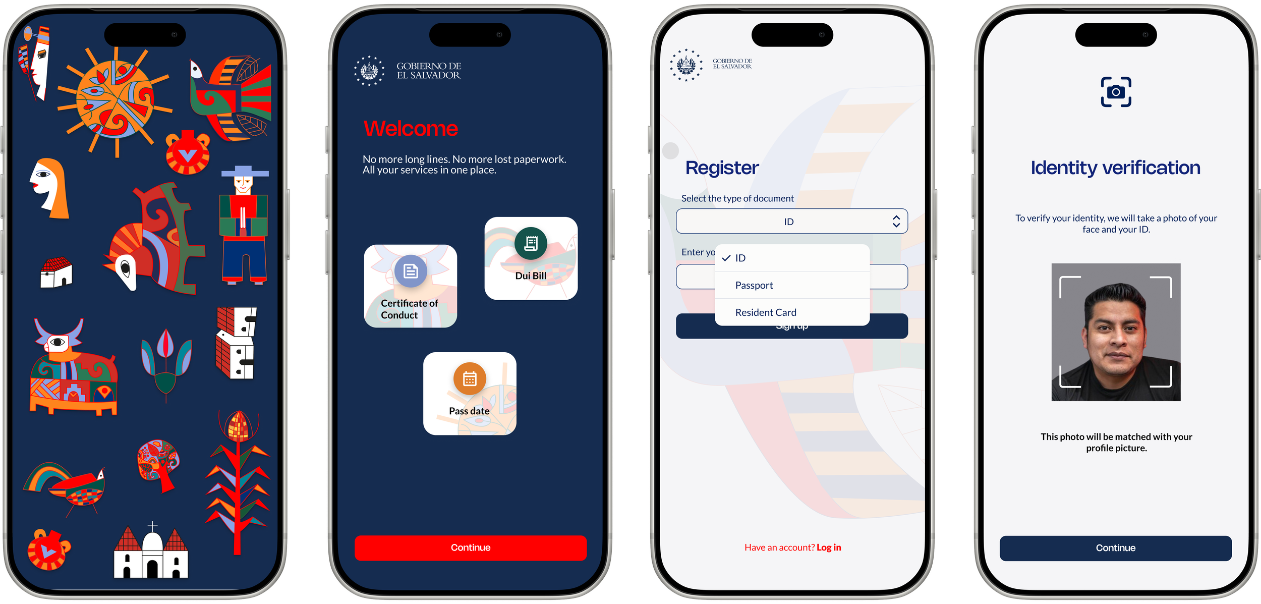
Onboarding
01
Home
02
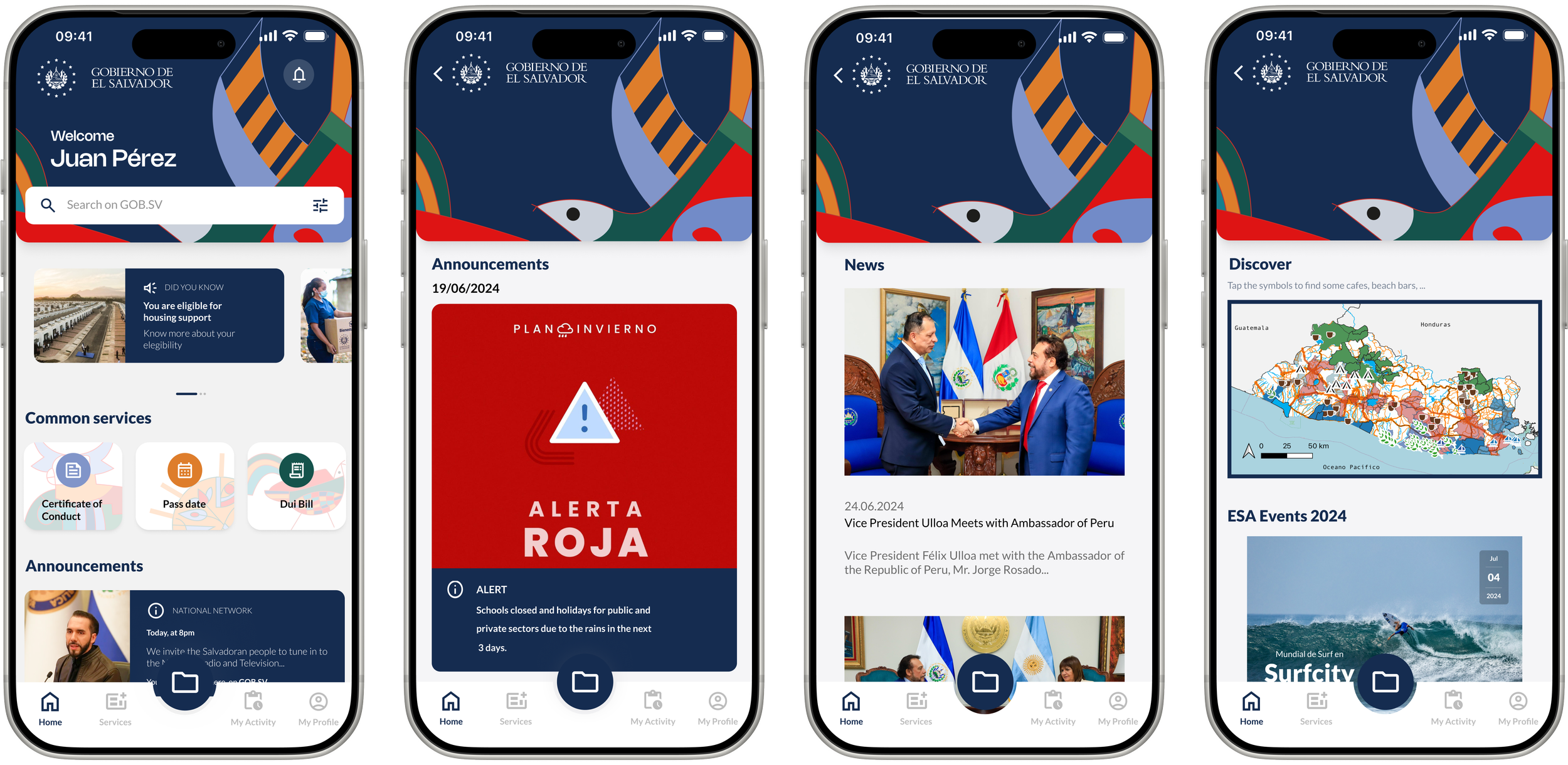
Services
03
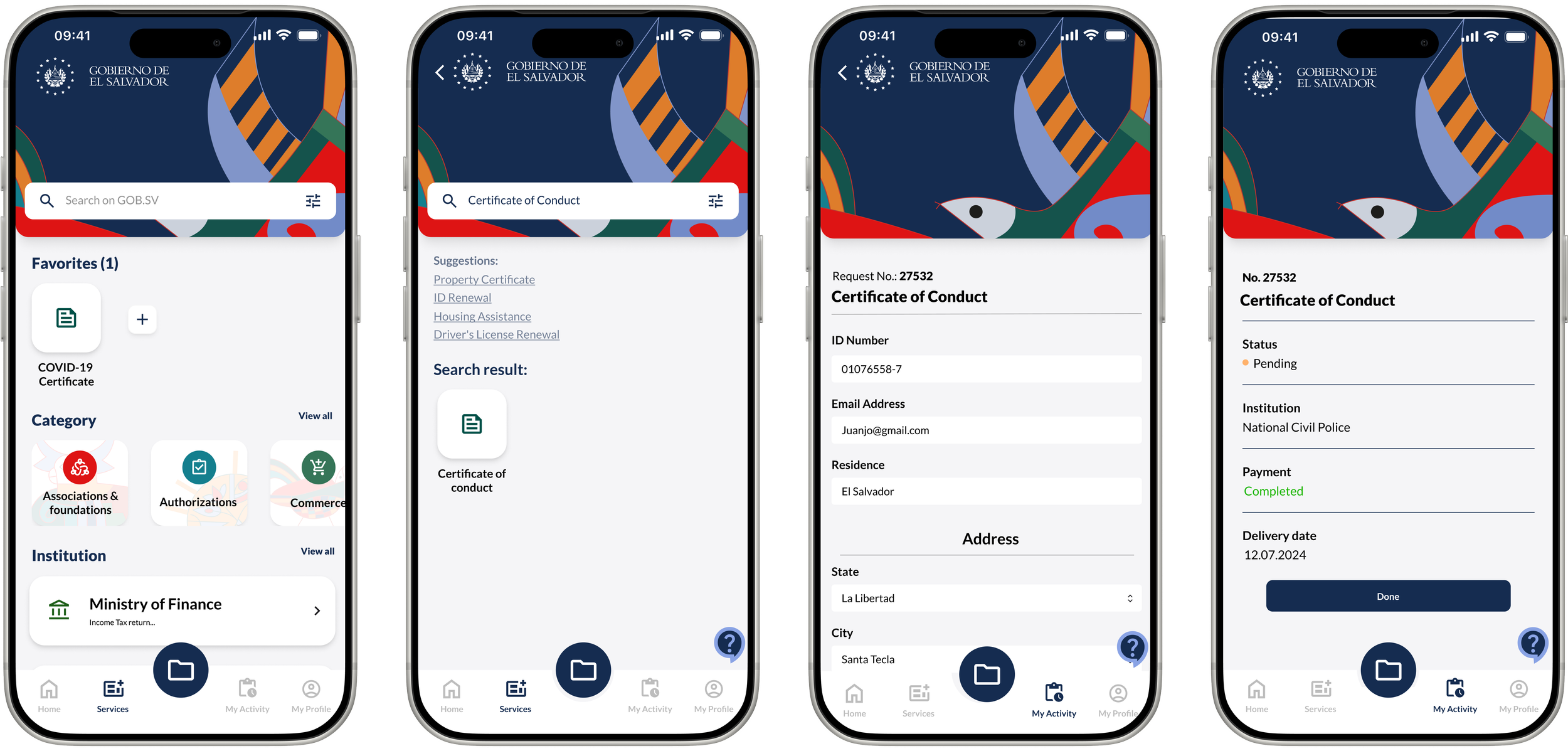
Documents
04
Activity & Profile
05
See it in
action.
08 / PROTYPE VIDEO
A walkthrough of the key user flows. Registration, finding a service, and the E-Wallet.