UbaT
UX/UI Design
USER INSIGHT
Menstrual cups are a sustainable alternative to disposable products, but they come with a unique challenge: you can’t easily tell when it’s time to empty them.
Many users feel uncertain or anxious, avoiding long outings or constantly guessing, afraid of leaking or discomfort.
Tracking flow and predicting your cycle without support can be unreliable. Even with growing interest in period tech, there's still a gap in real-time, intuitive tools that help people feel confident and in control.

CONCEPT
This project was centered around a key design question:
How can we bring digital life to a traditionally analog, physical product?
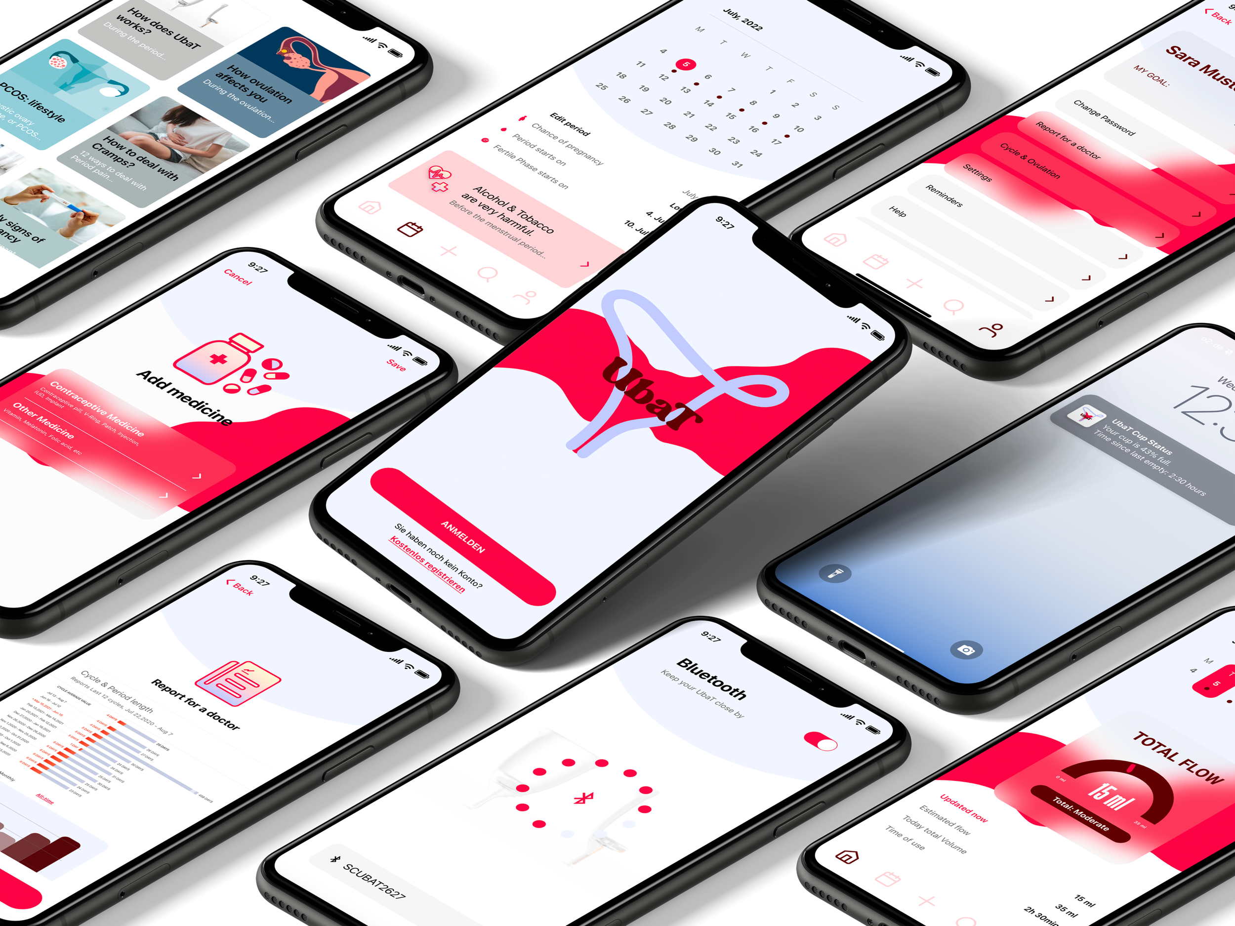
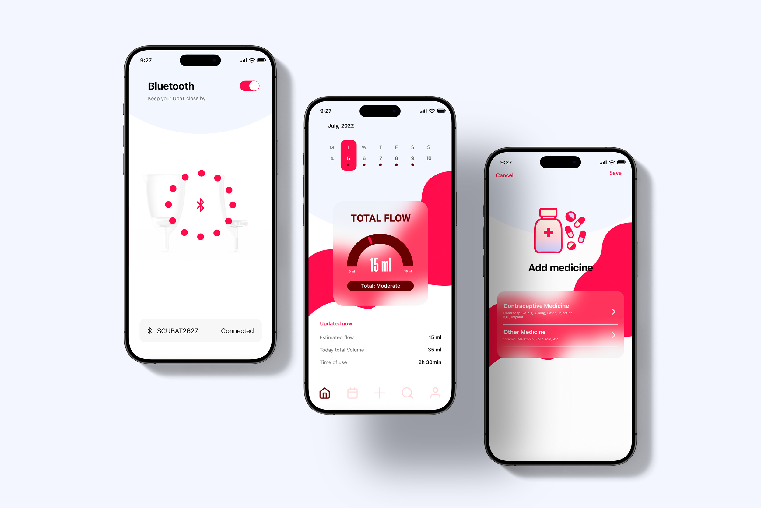
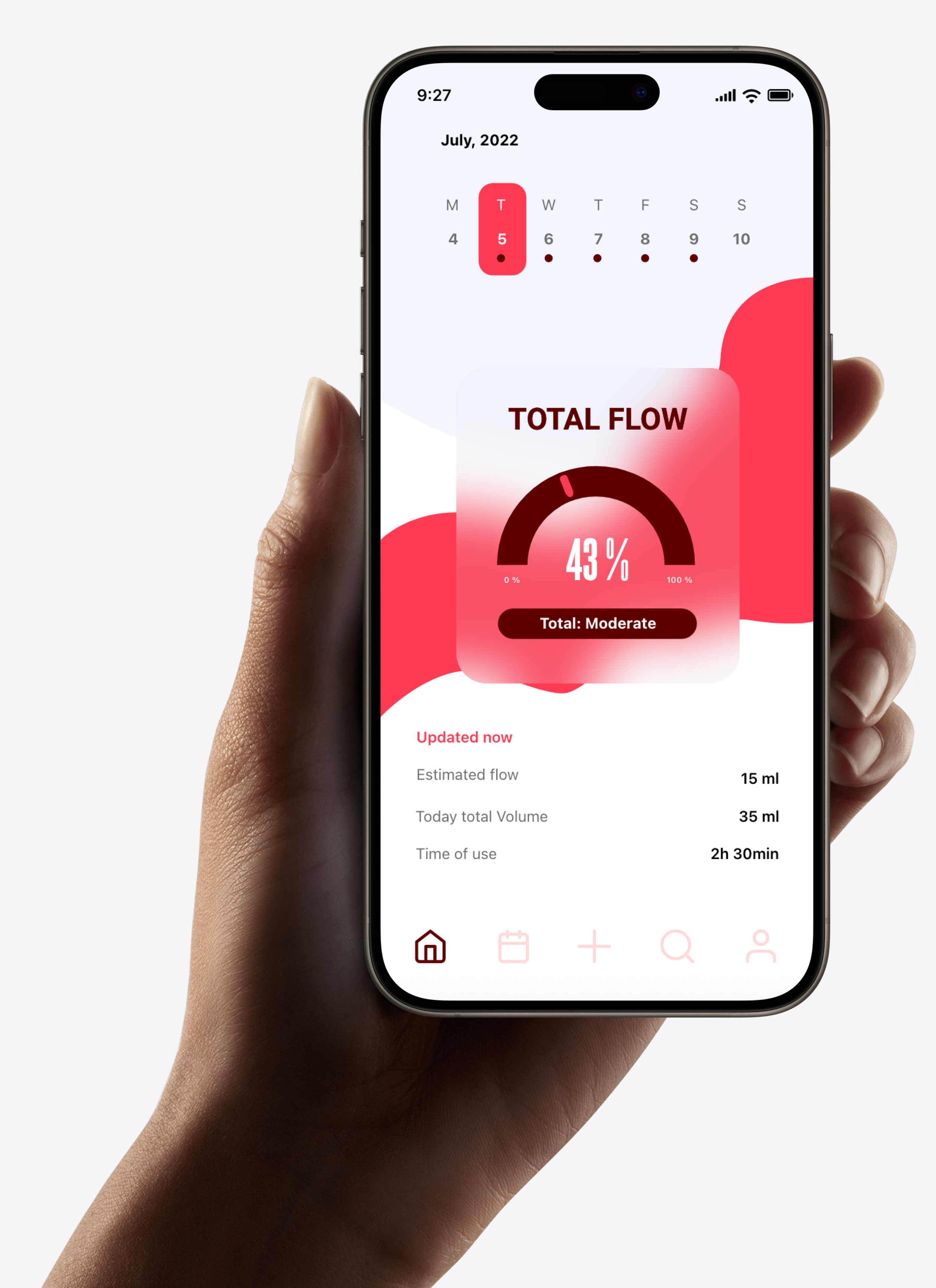
UbaT is a smart app created to transform the menstrual cup, a silent, analog object, into a connected experience.
By pairing via Bluetooth, the app translates physical data like flow level into useful, personalized digital feedback, helping users know when to refresh, track daily volume, and monitor their monthly cycle.
The goal was to make the cup smarter, not by adding complexity, but by adding clarity, comfort, and support through design.
DESIGN
The design of UbaT moves away from the traditionally clinical or overly discreet aesthetics often associated with menstrual products. Instead, it embraces a modern, feminine, and cheerful visual language.
Bright, saturated colors and bold shapes make the experience feel lively and confident, without losing clarity or calm. The interface is minimal but expressive, designed to feel fresh and comfortable in your hand, not hidden.
With smooth curves, soft gradients, and open layouts, the app invites users to see their cycle as something natural and powerful, not something to downplay.
UbaT’s design reflects a shift in how we talk about periods: with honesty, visibility, and a bit of joy.